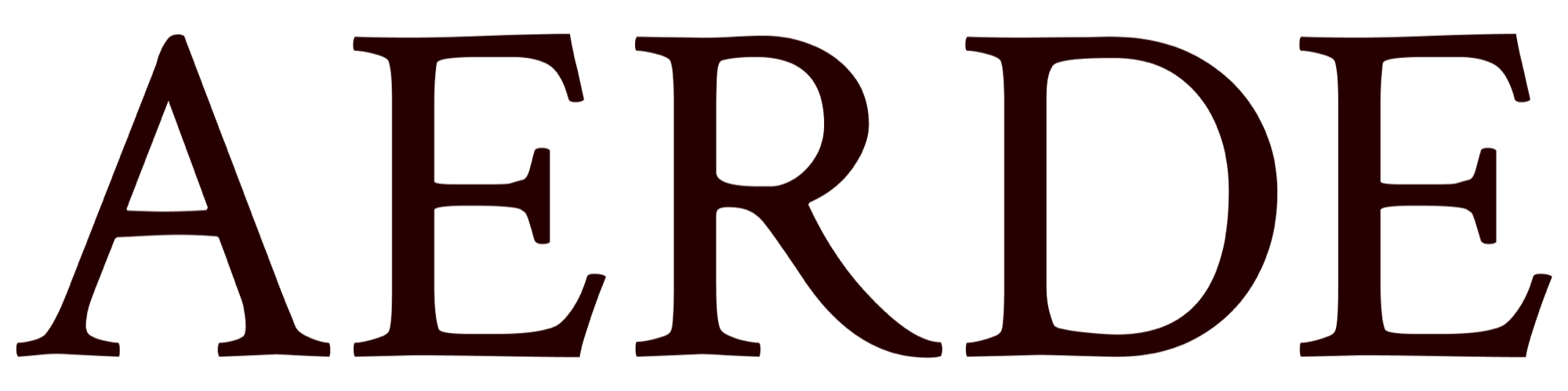
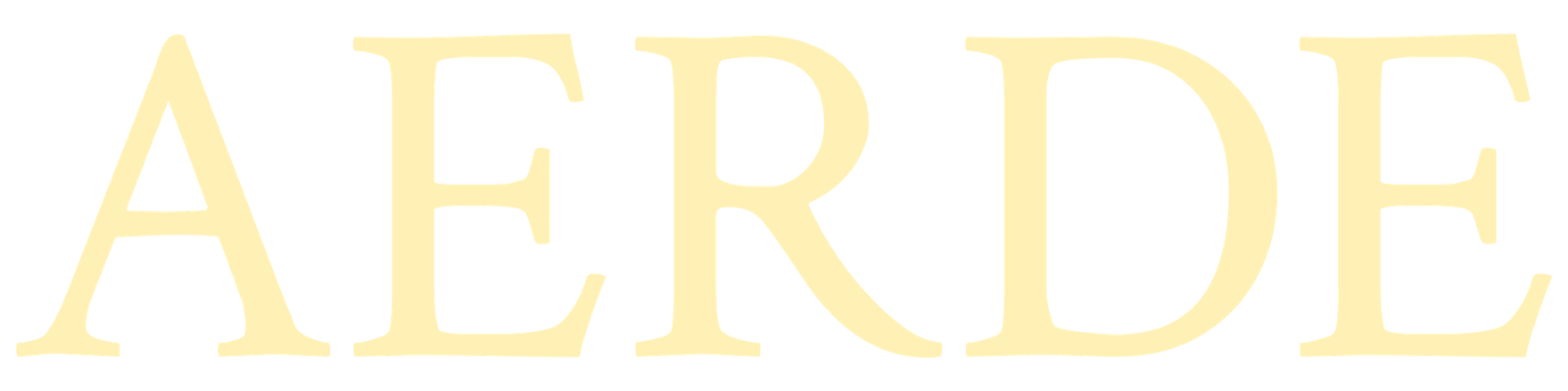
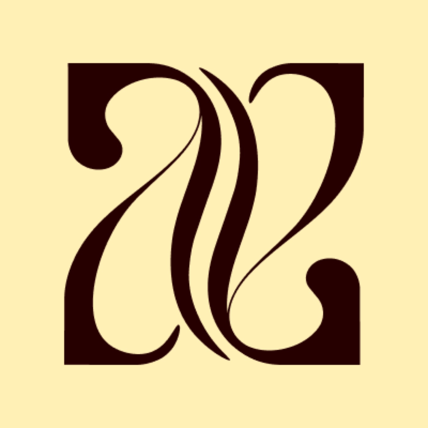
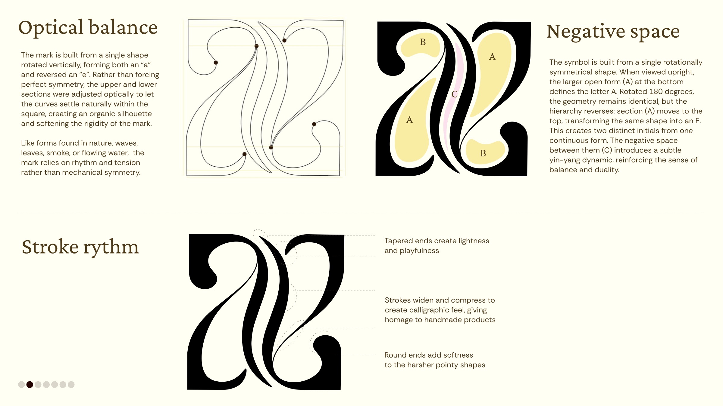
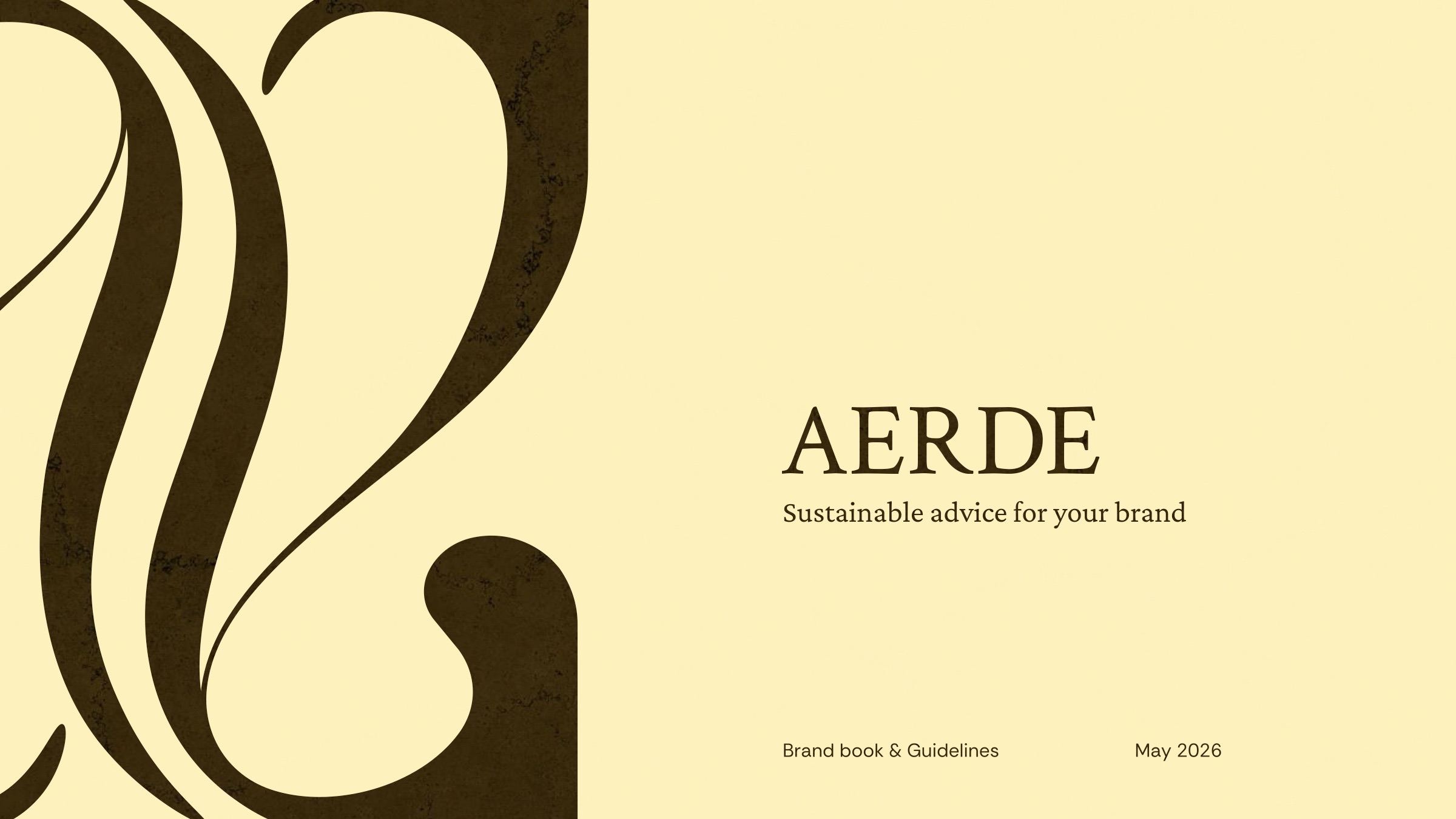
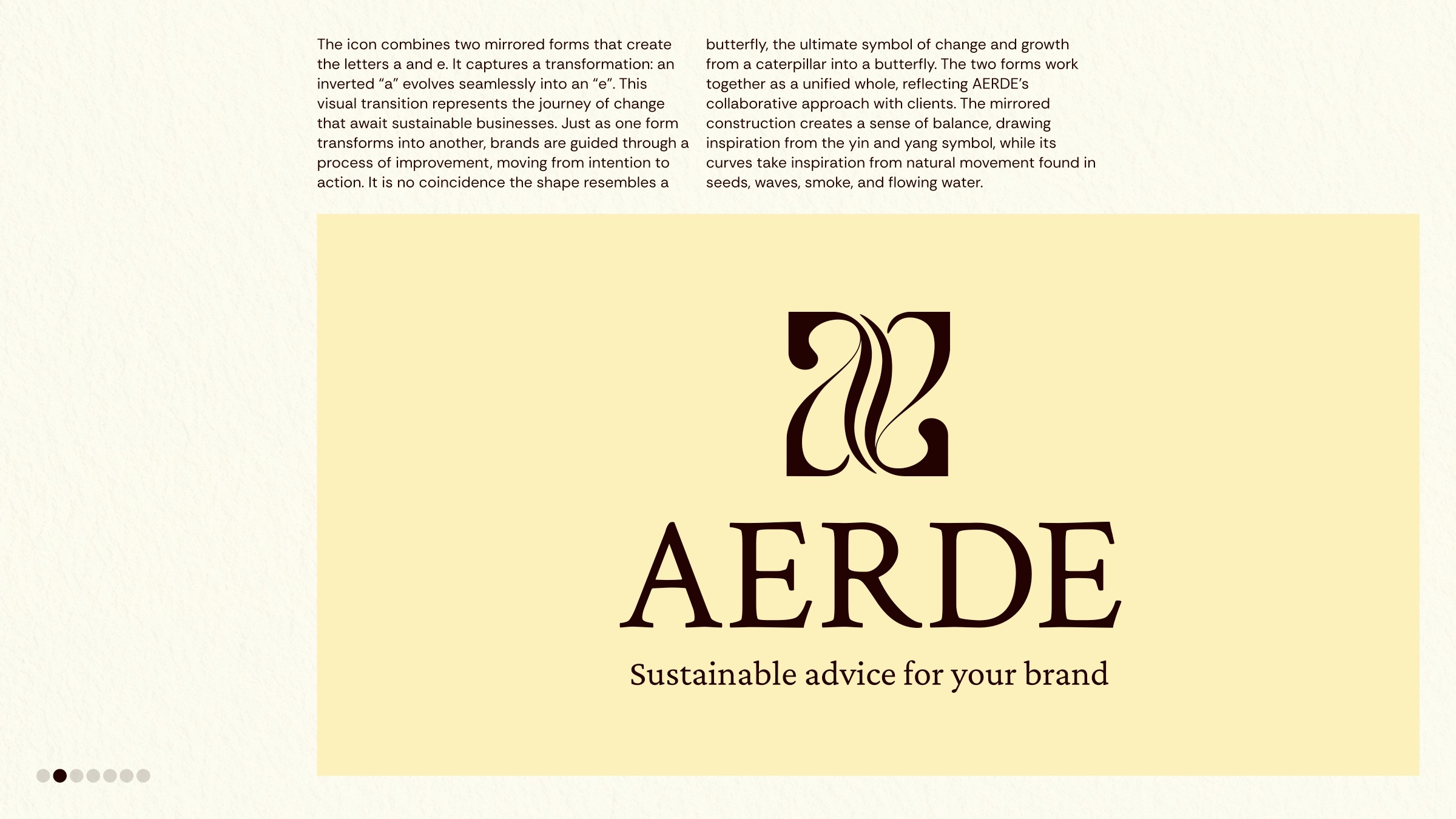
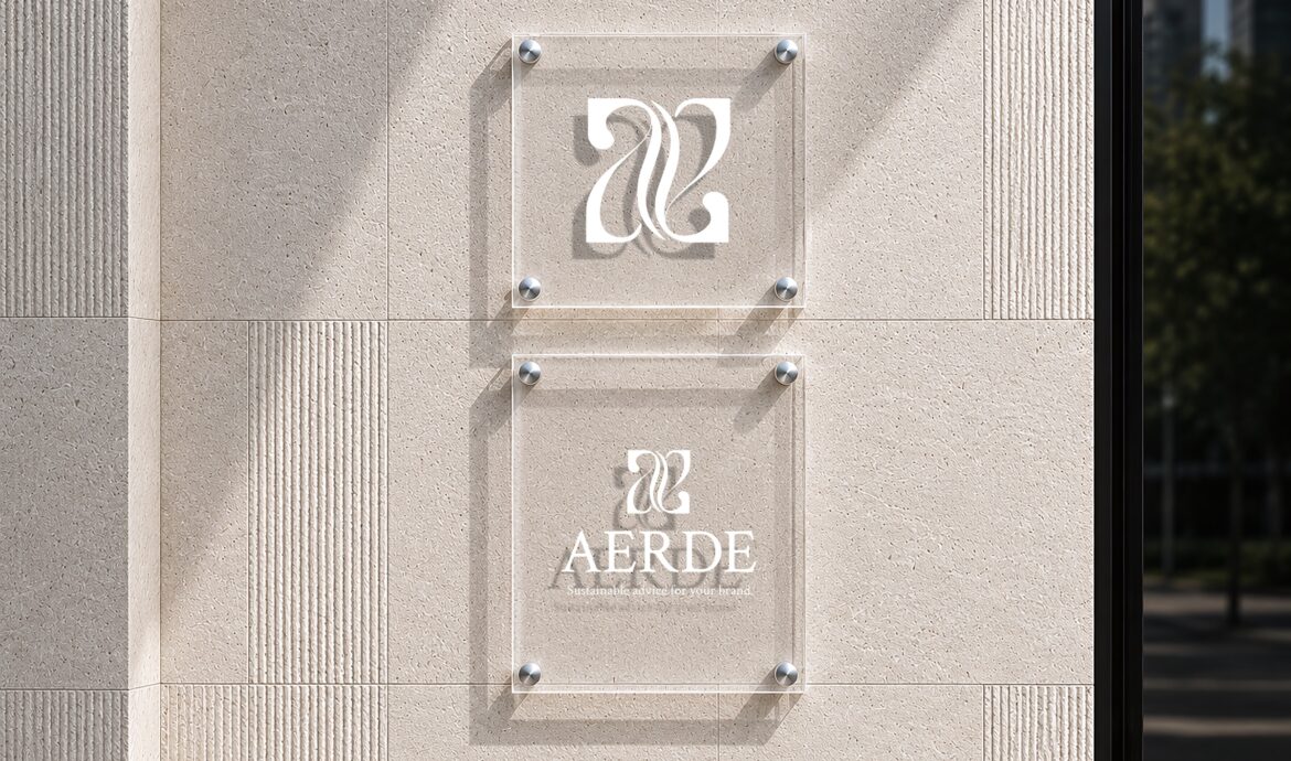
Two mirrored forms create the letters a and e: an inverted “a” evolves seamlessly into an “e”.
The transition represents the journey of change that awaits sustainable businesses. It’s no coincidence the shape resembles a butterfly; the mirrored construction draws on yin and yang, its curves on seeds, waves, smoke and flowing water.
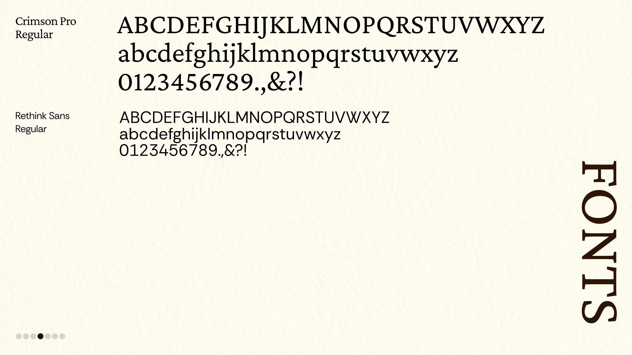
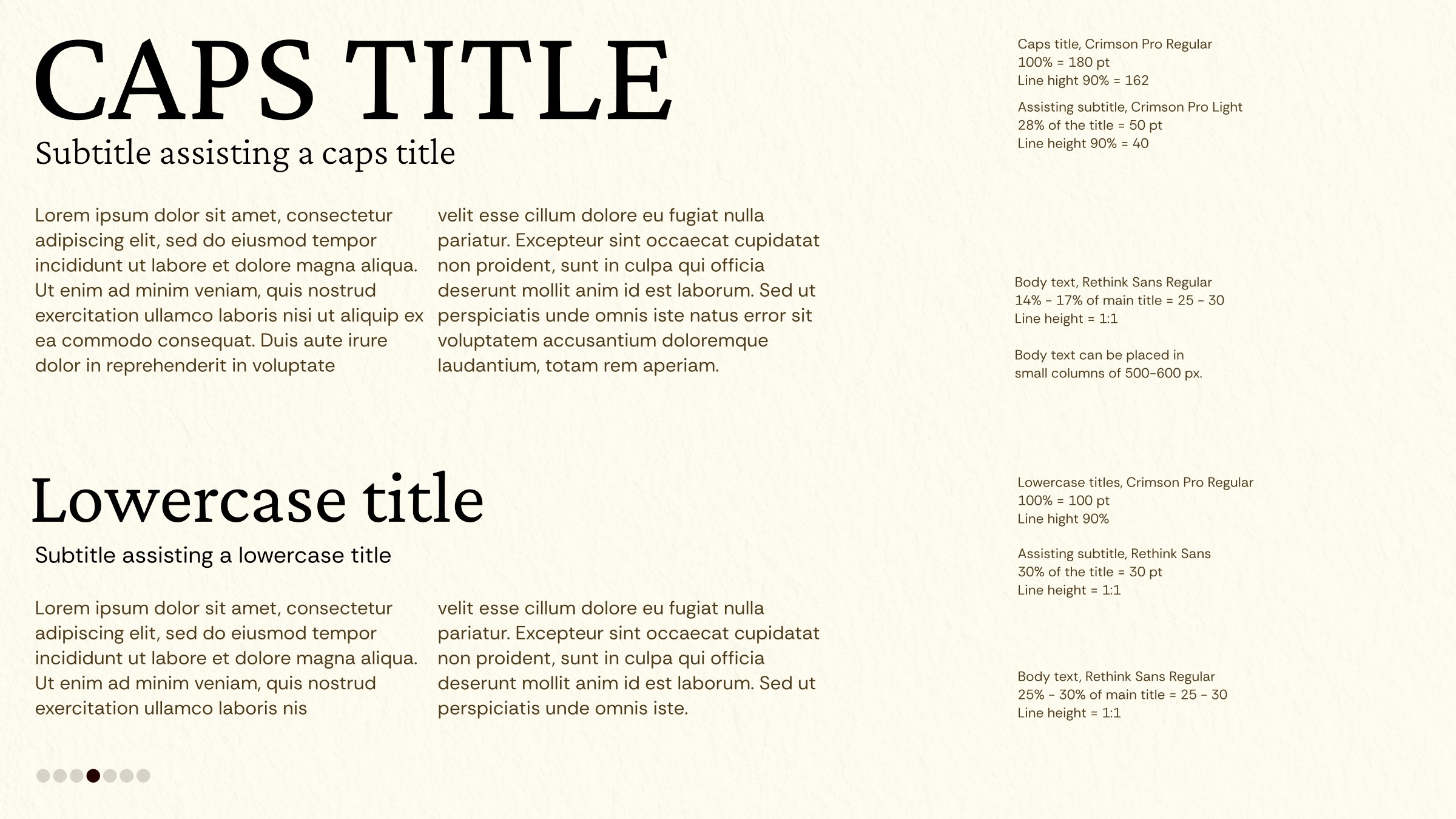
Set in Crimson Pro: elegant and strong, never overly formal.
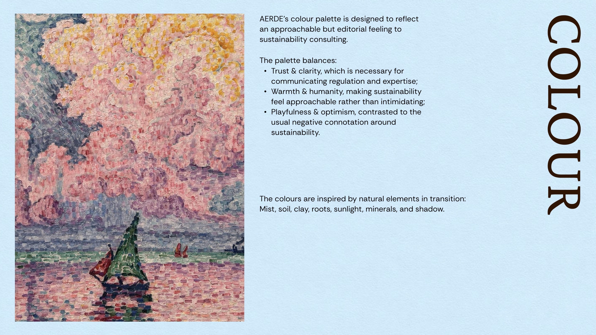
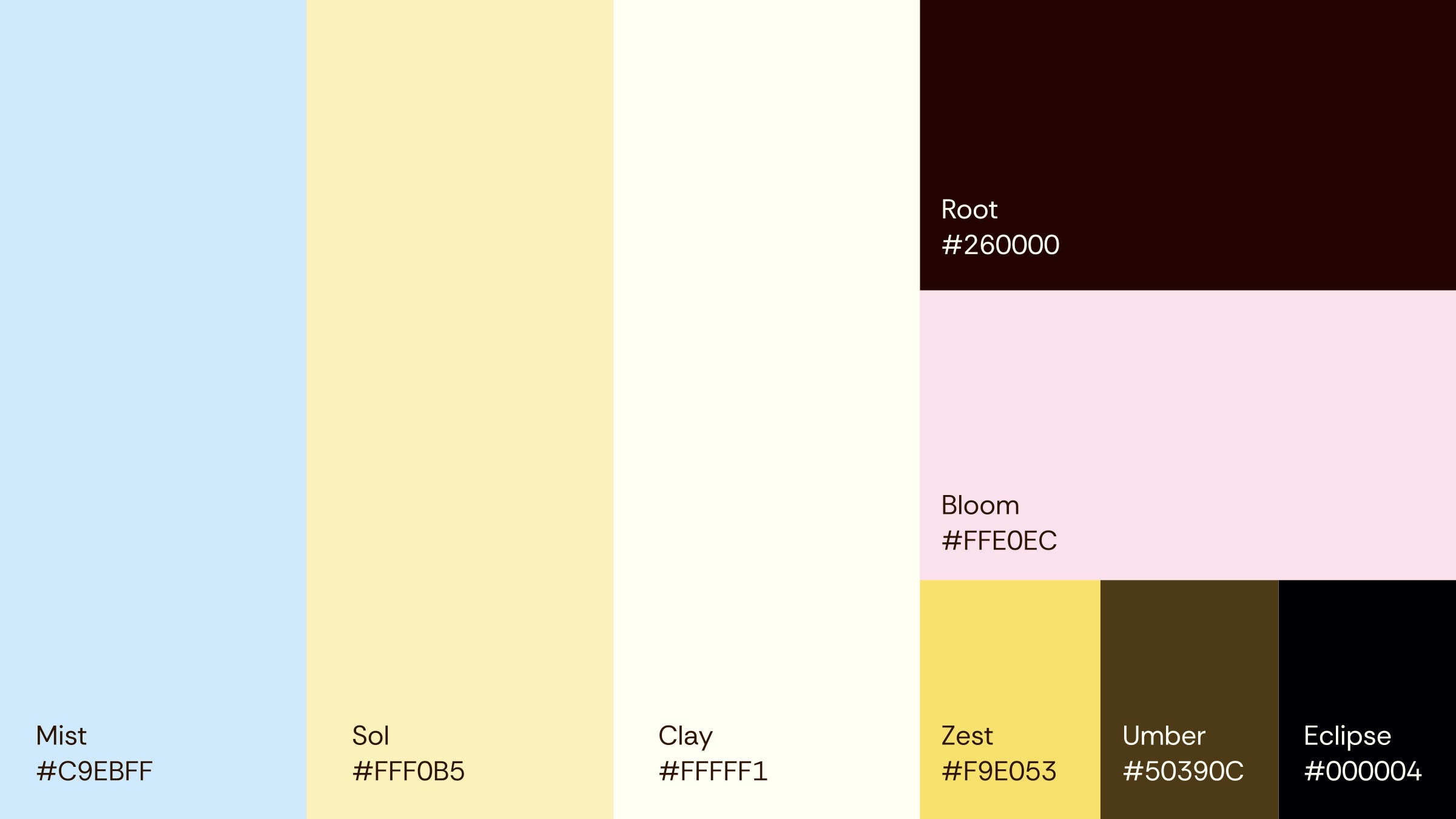
Natural elements in transition: mist, soil, clay, roots, sunlight, minerals and shadow.
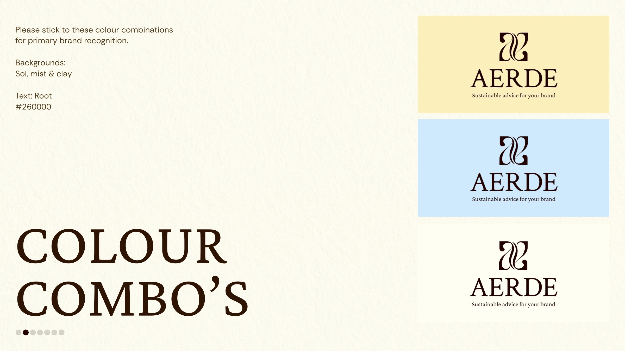
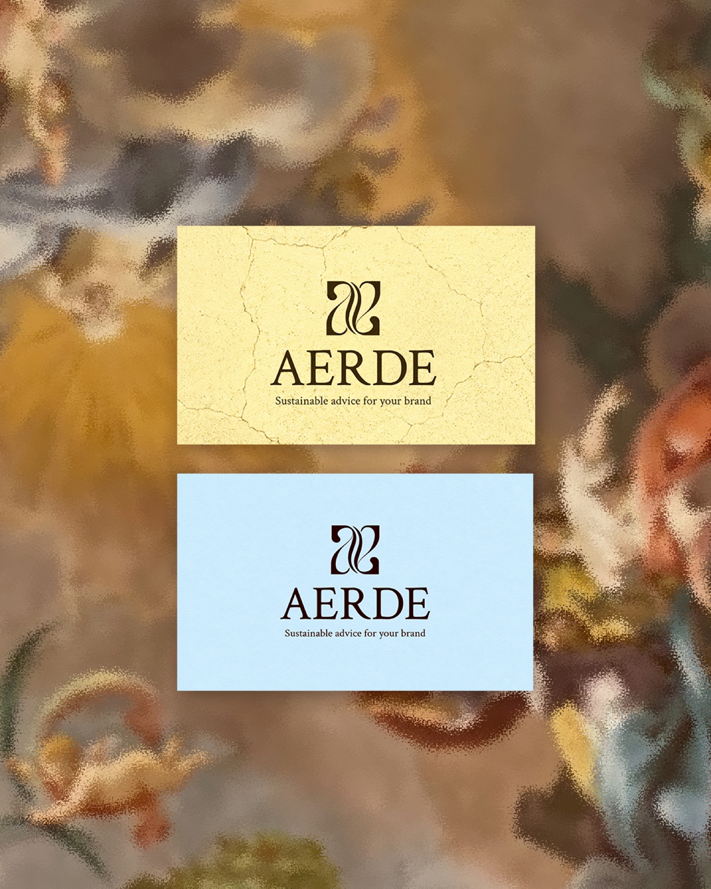
An approachable but editorial palette that balances trust, warmth & optimism, the opposite of the usual heavy tone around sustainability.
Classic meets current, intellect meets accessibility.
An expressive serif paired with a clean contemporary sans: one brings emotion, the other delivers clarity.
Placed intuitively, structured underneath.
Images appear asymmetrically across a layout for a sense of spontaneity, but always sit on an underlying grid, with sharp edges and clean cropping, balanced by structured text boxes. Curated and effortless at the same time.
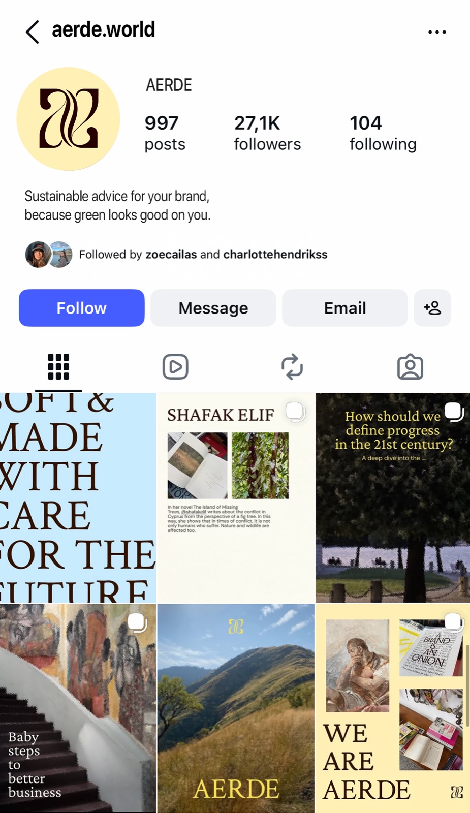
Showing up consistently, starting with Instagram and LinkedIn.
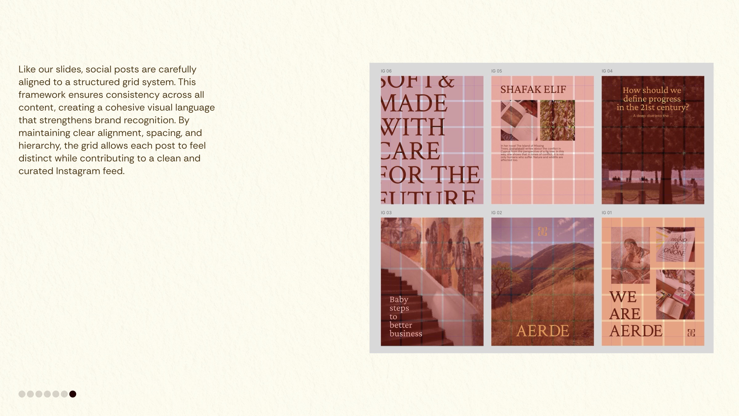
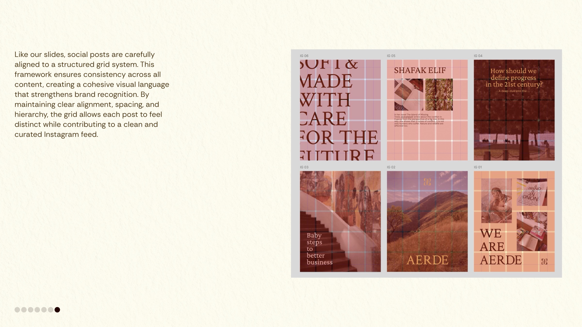
Like the slides, every post sits on a structured grid: clear alignment, spacing and hierarchy, so each post feels distinct while the feed stays clean and curated.
Where the identity comes to life
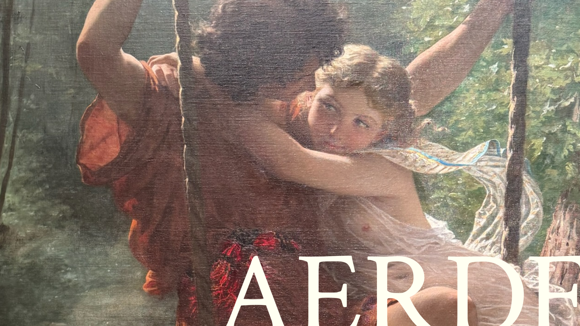
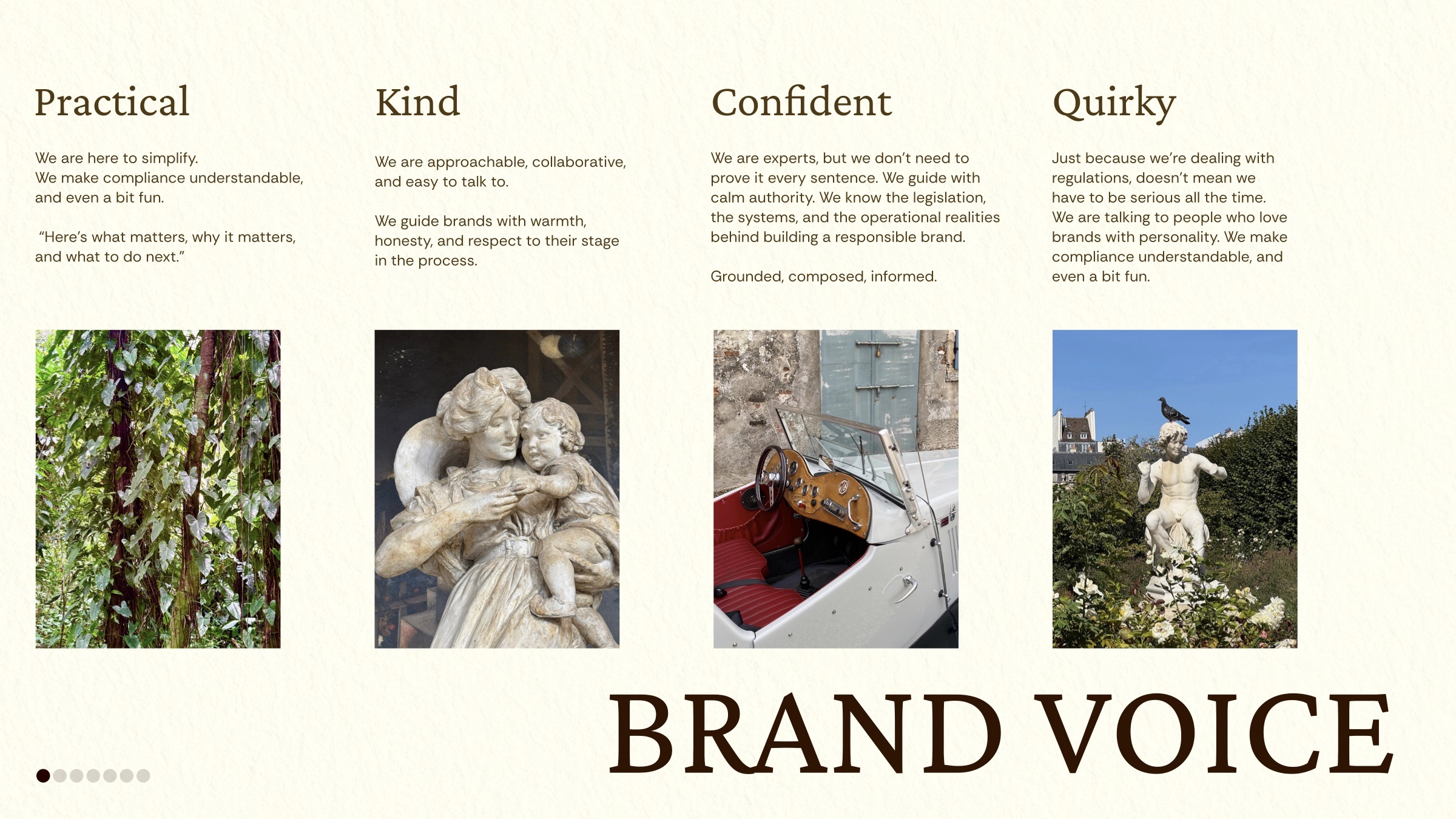
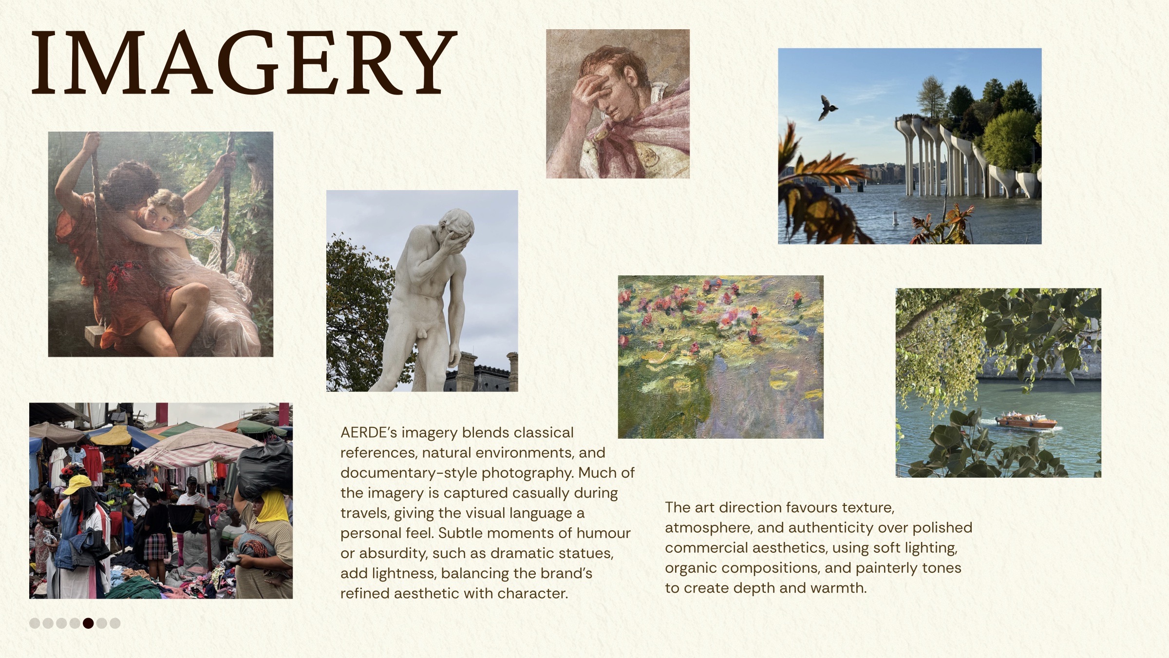
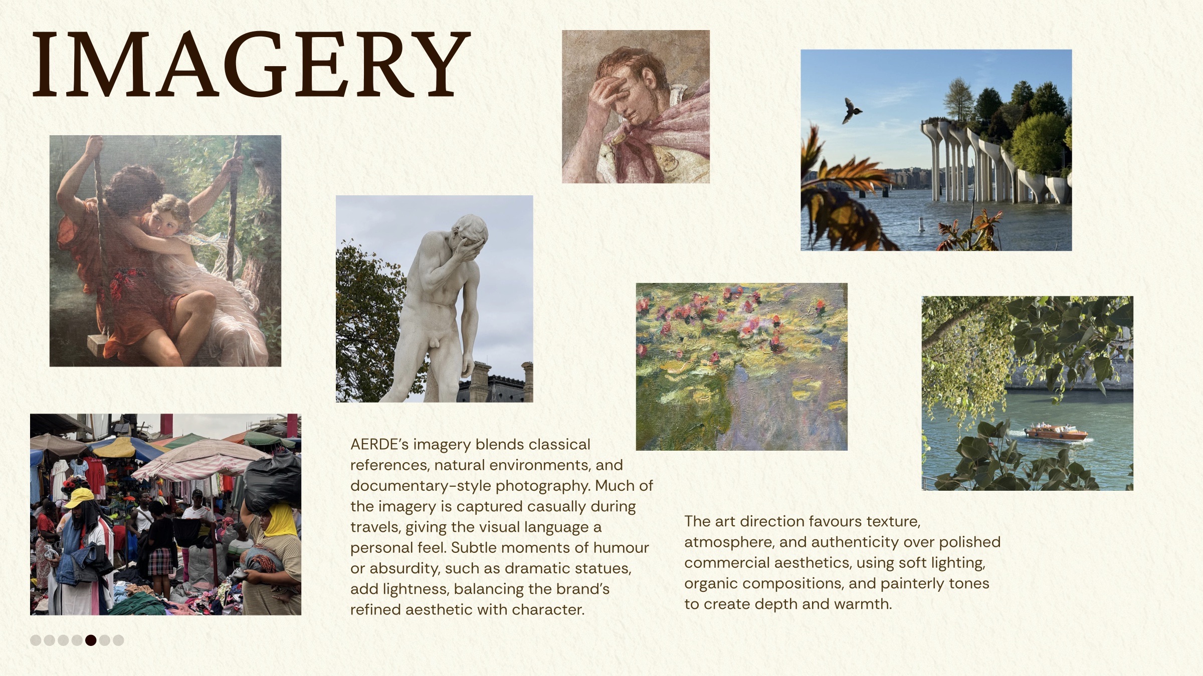
Classical references, natural environments and documentary photography, with subtle moments of humour.
Much of the imagery is captured casually during travels, which gives the visual language a personal feel. Dramatic statues and other small absurdities add lightness, balancing the brand’s refined aesthetic with character.
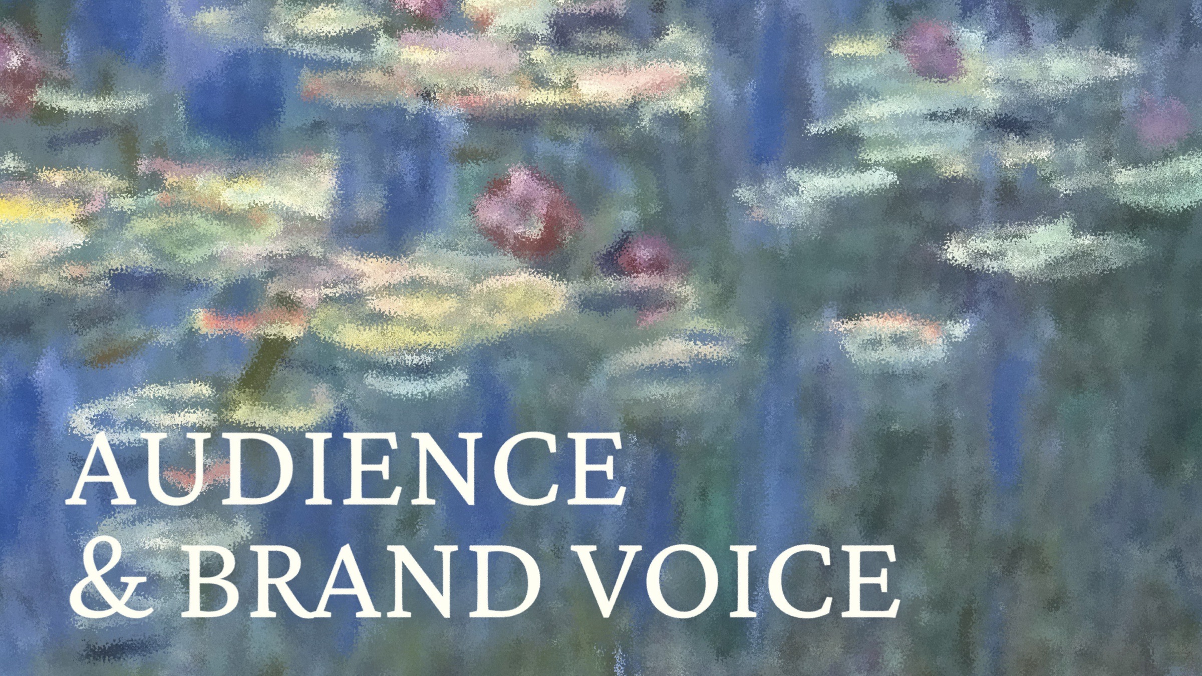
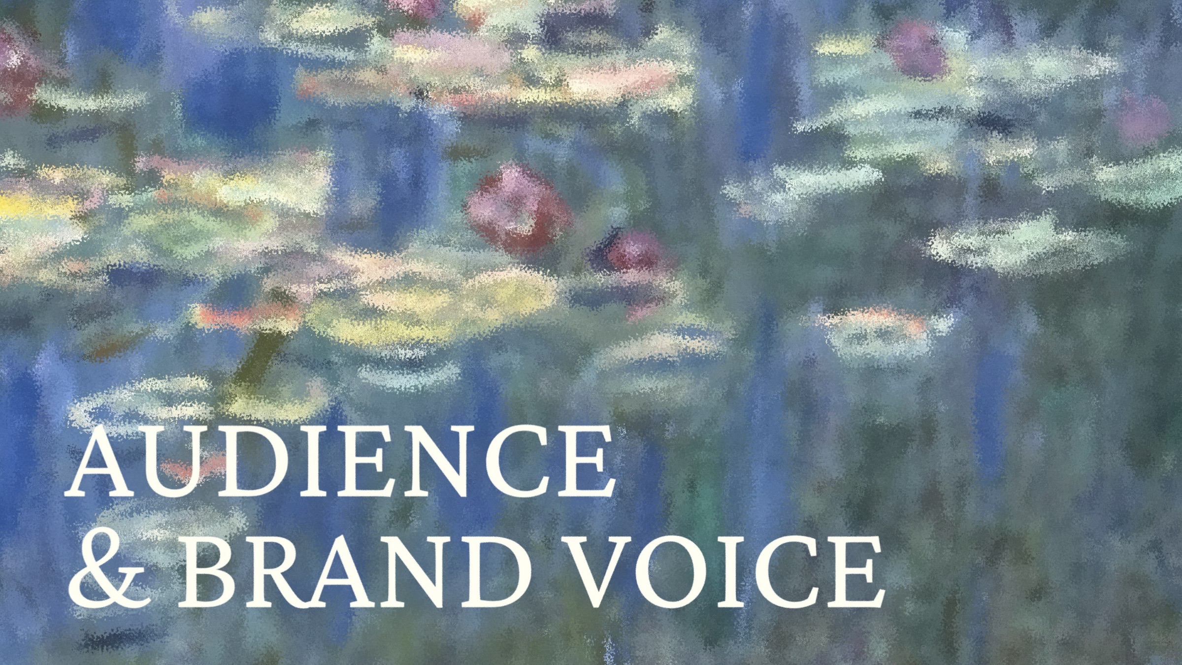
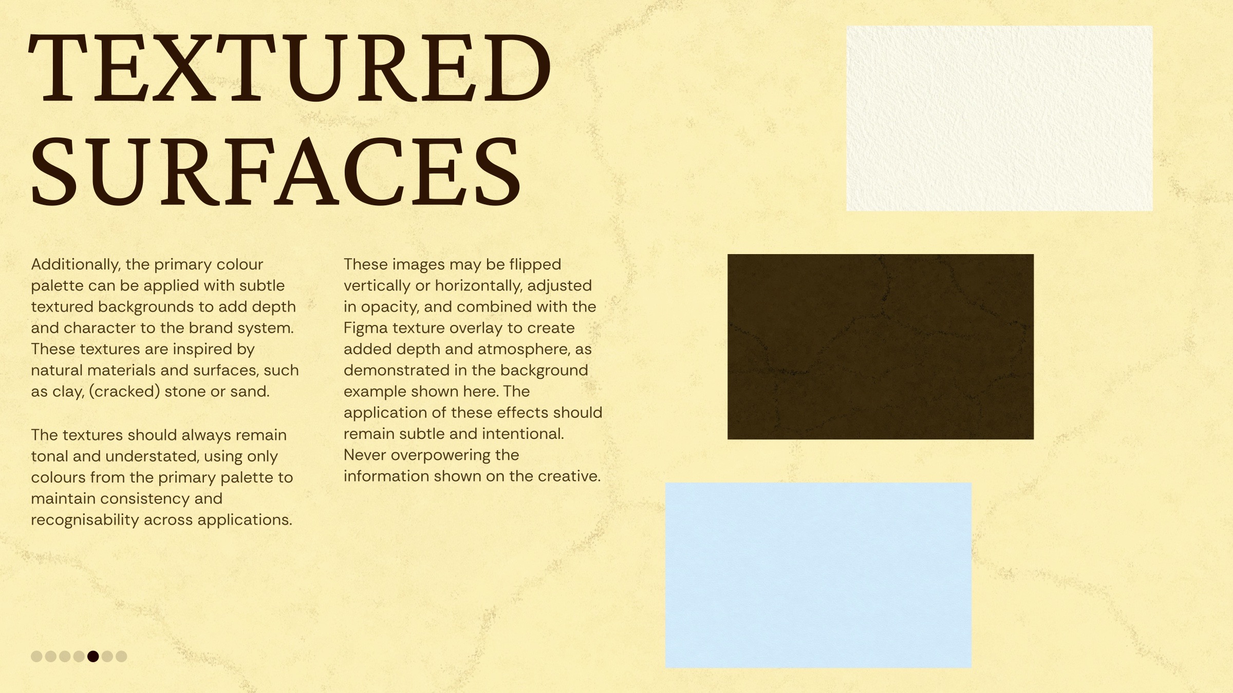
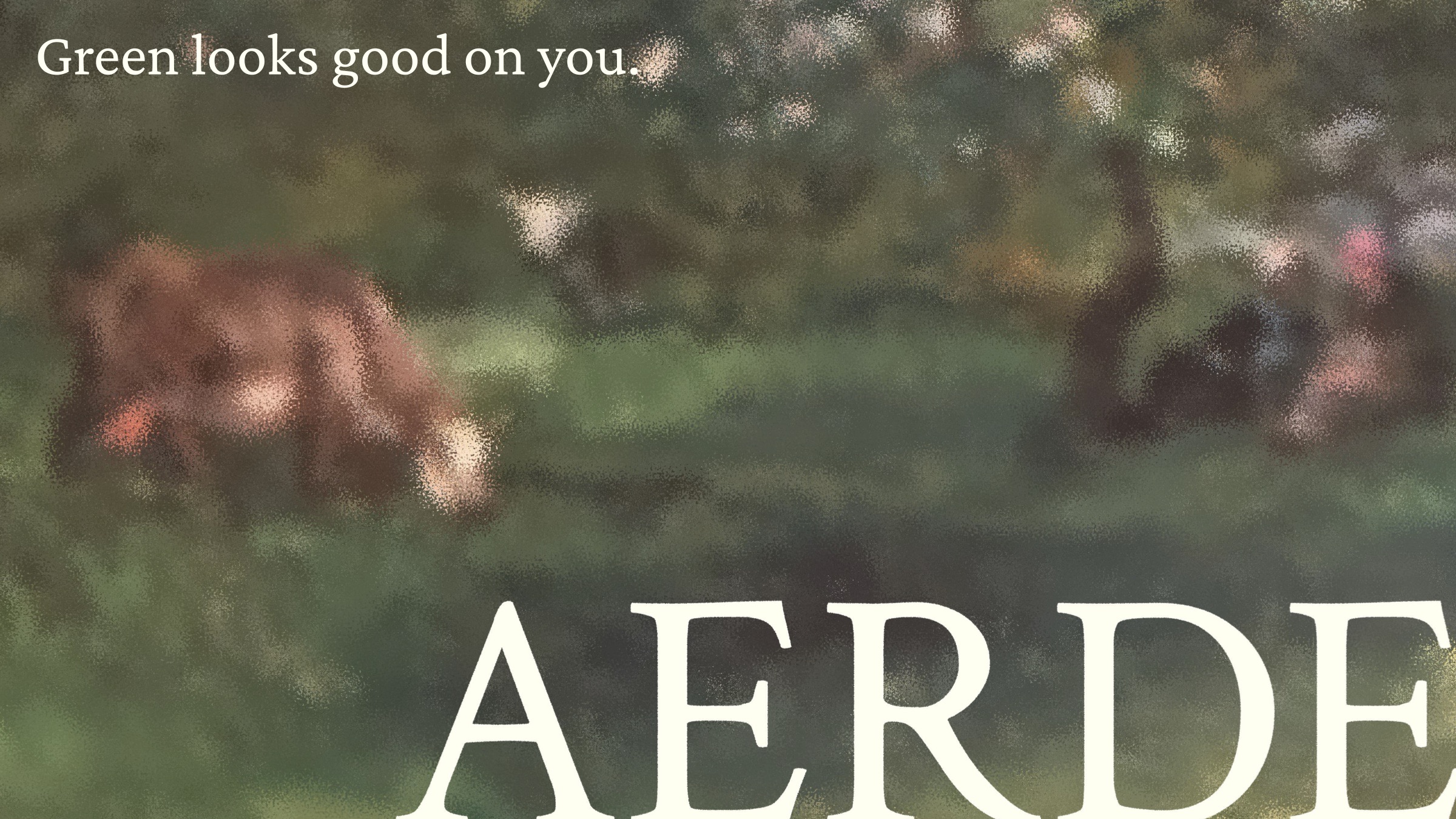
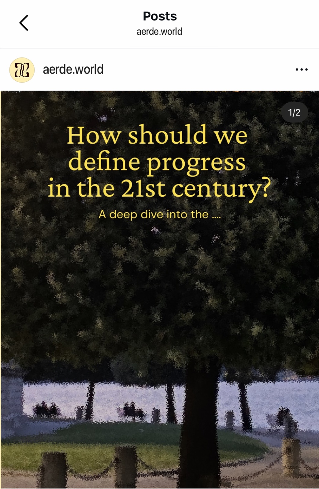
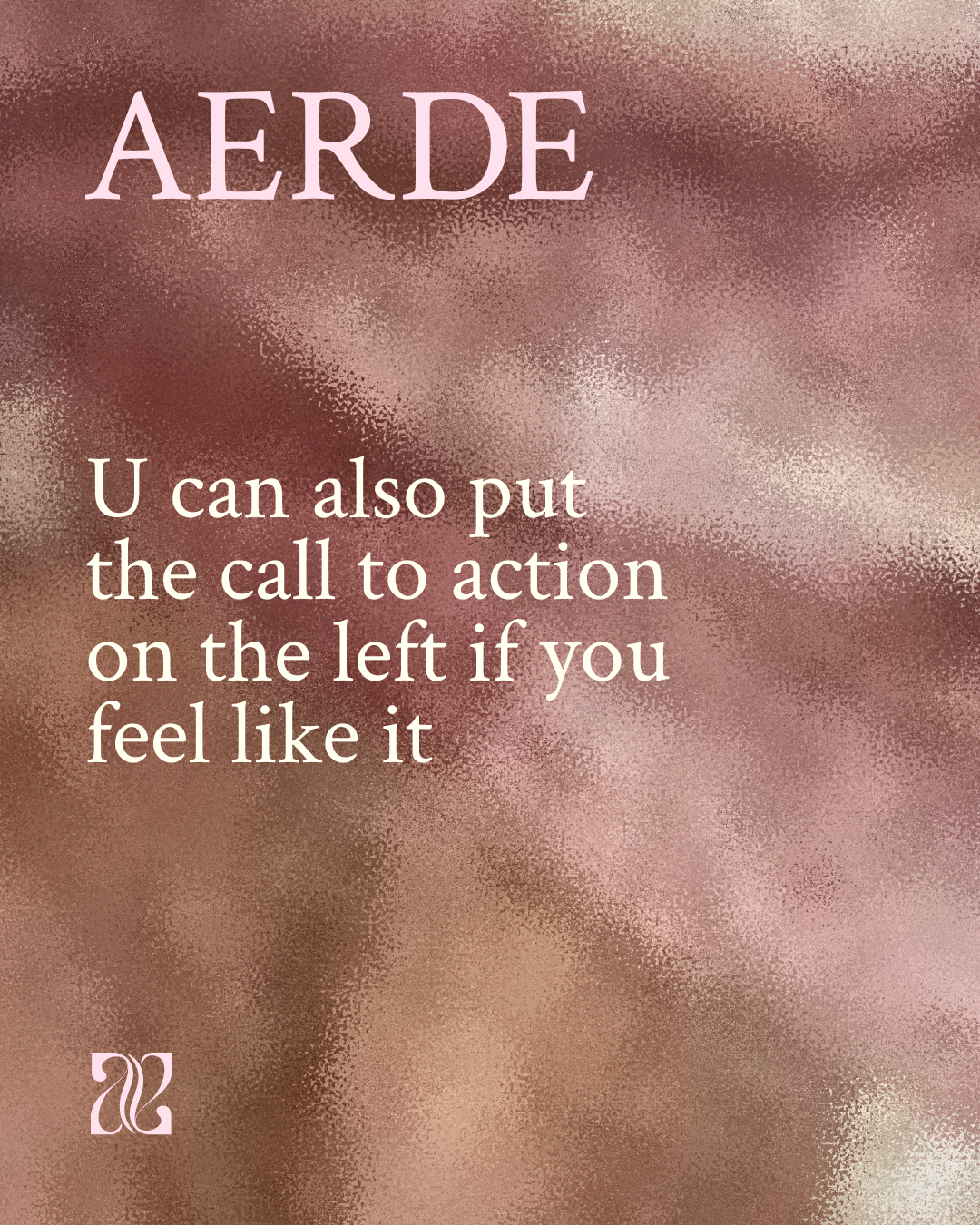
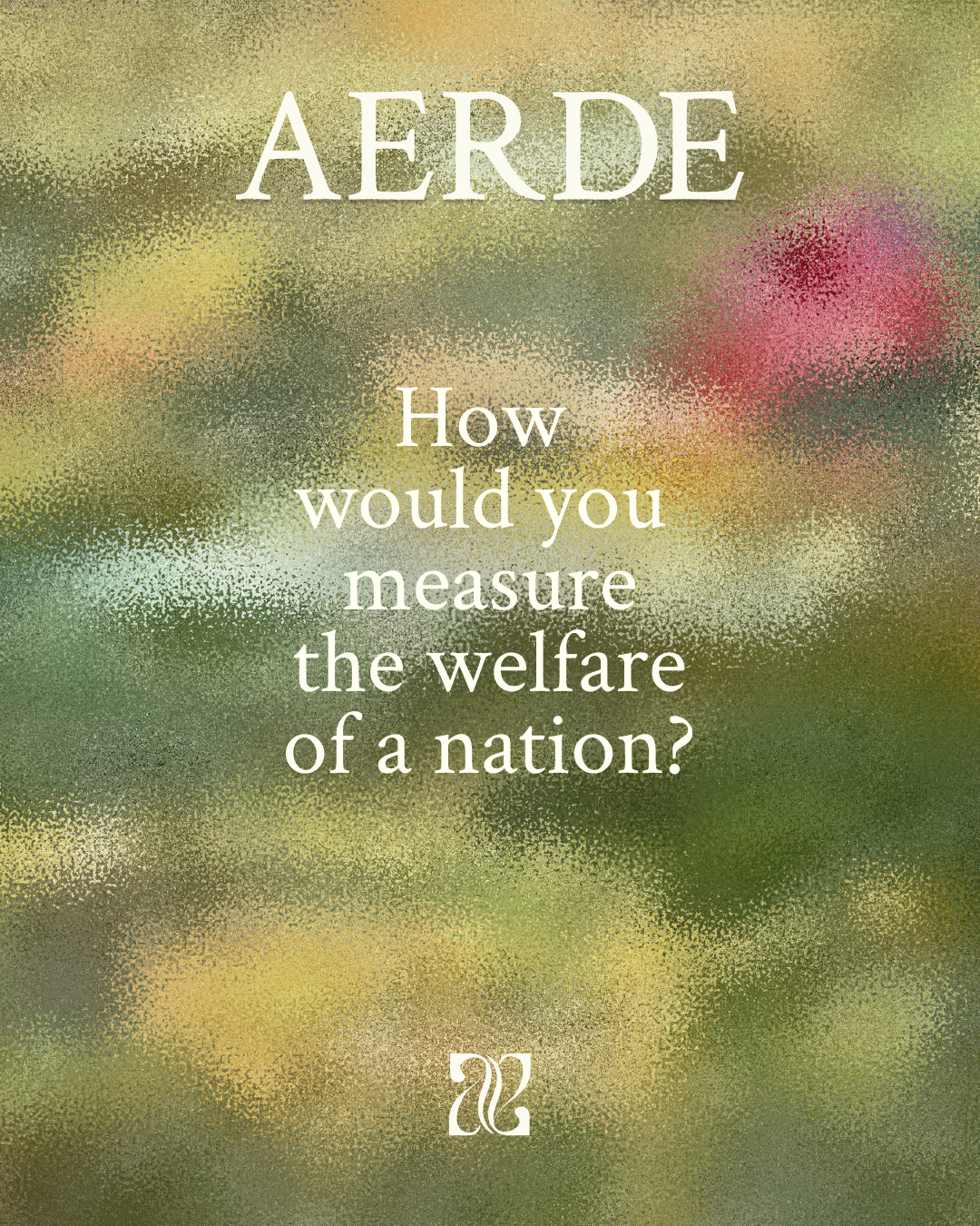
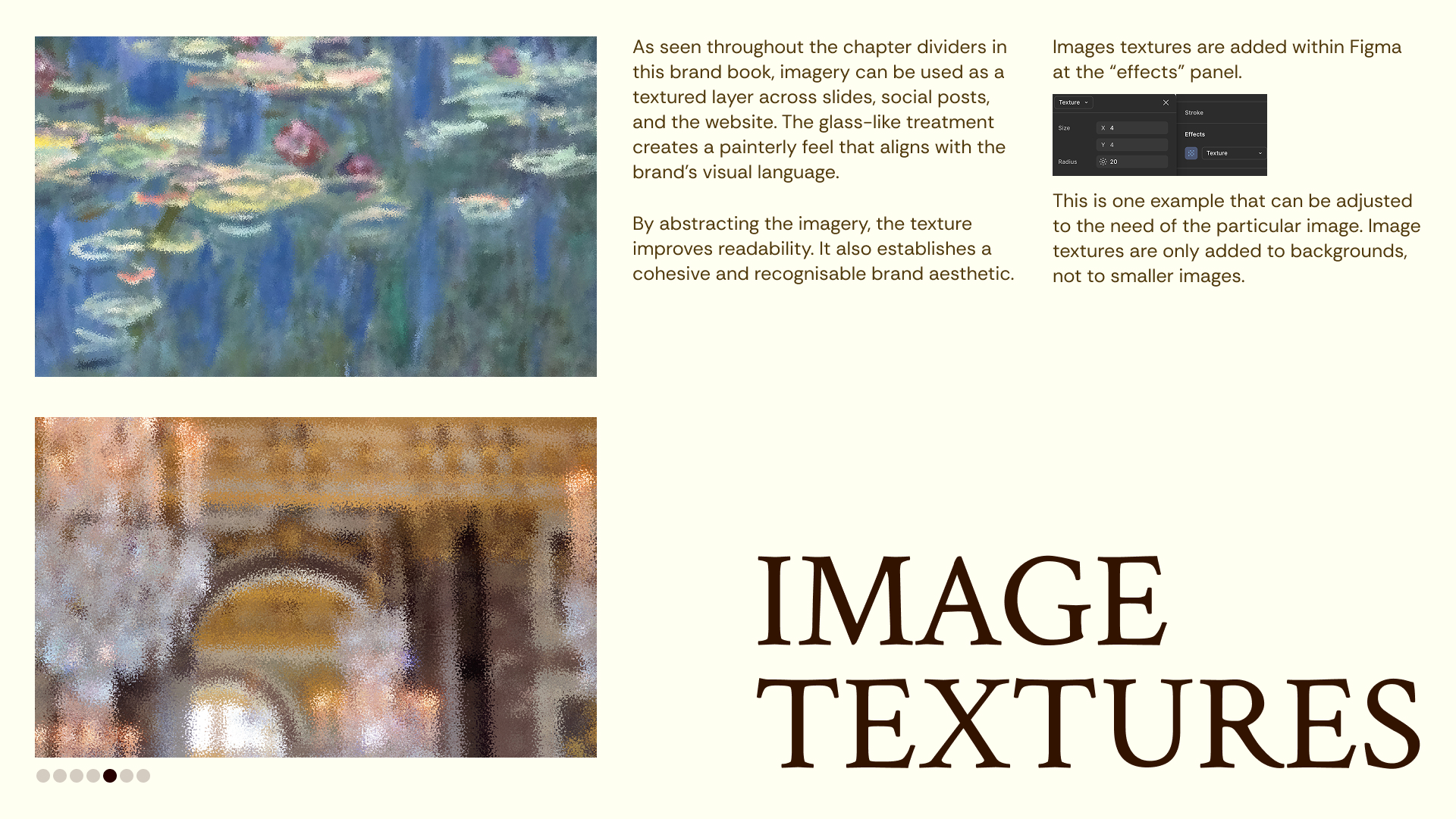
A glass-like texture turns imagery into a painterly background, for slides, social posts and the website.
By abstracting the image, the texture improves readability and creates a cohesive, recognisable look. Textures are only used on backgrounds, never on smaller images.