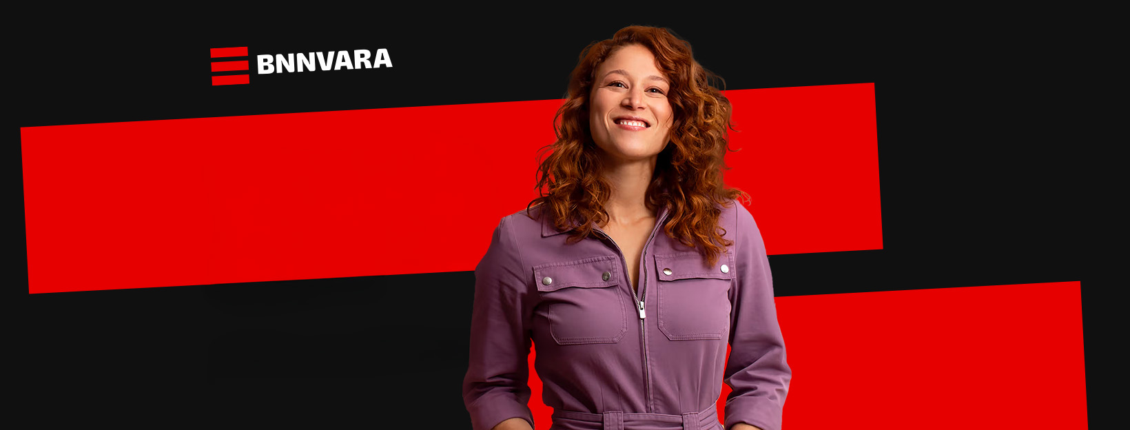
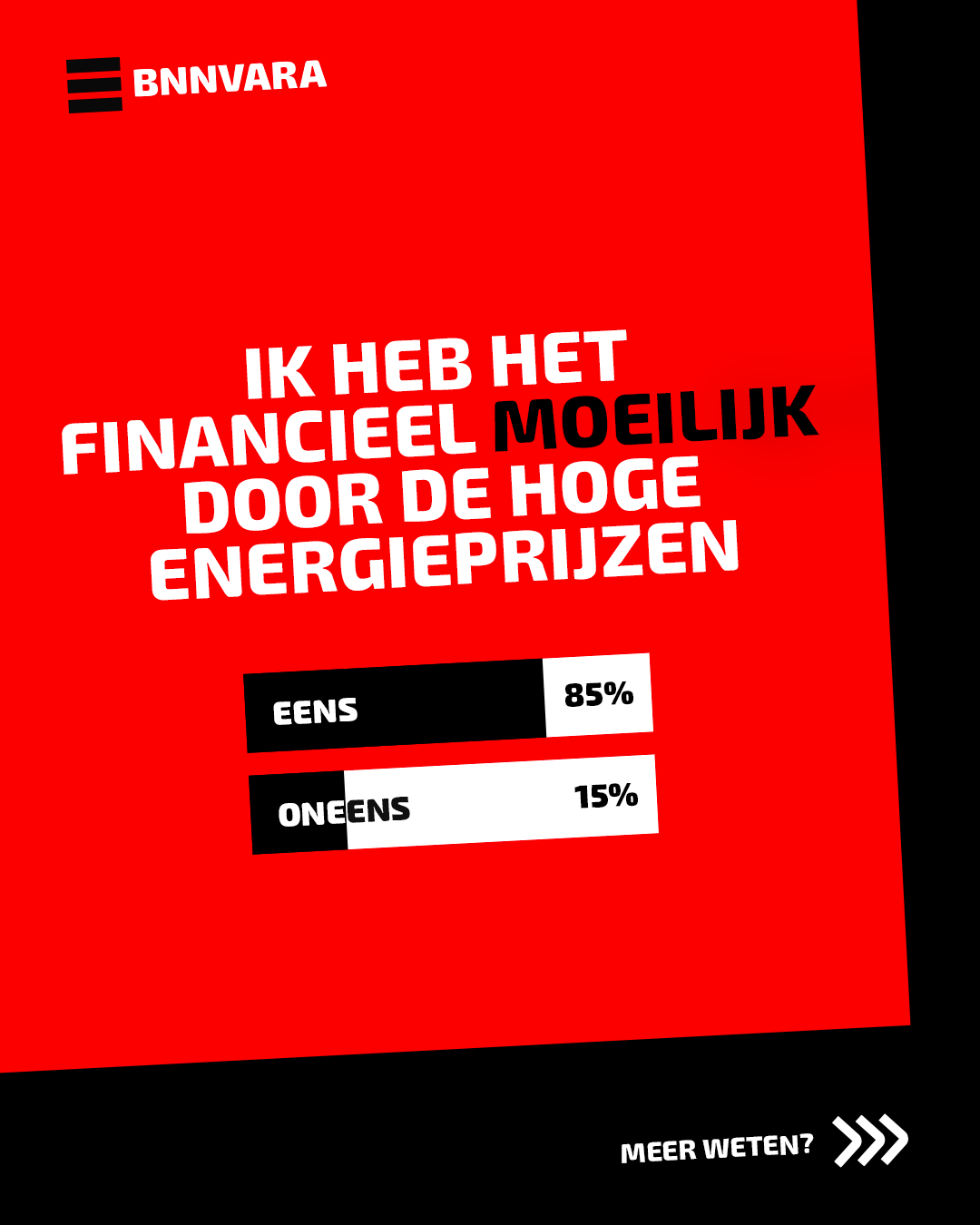
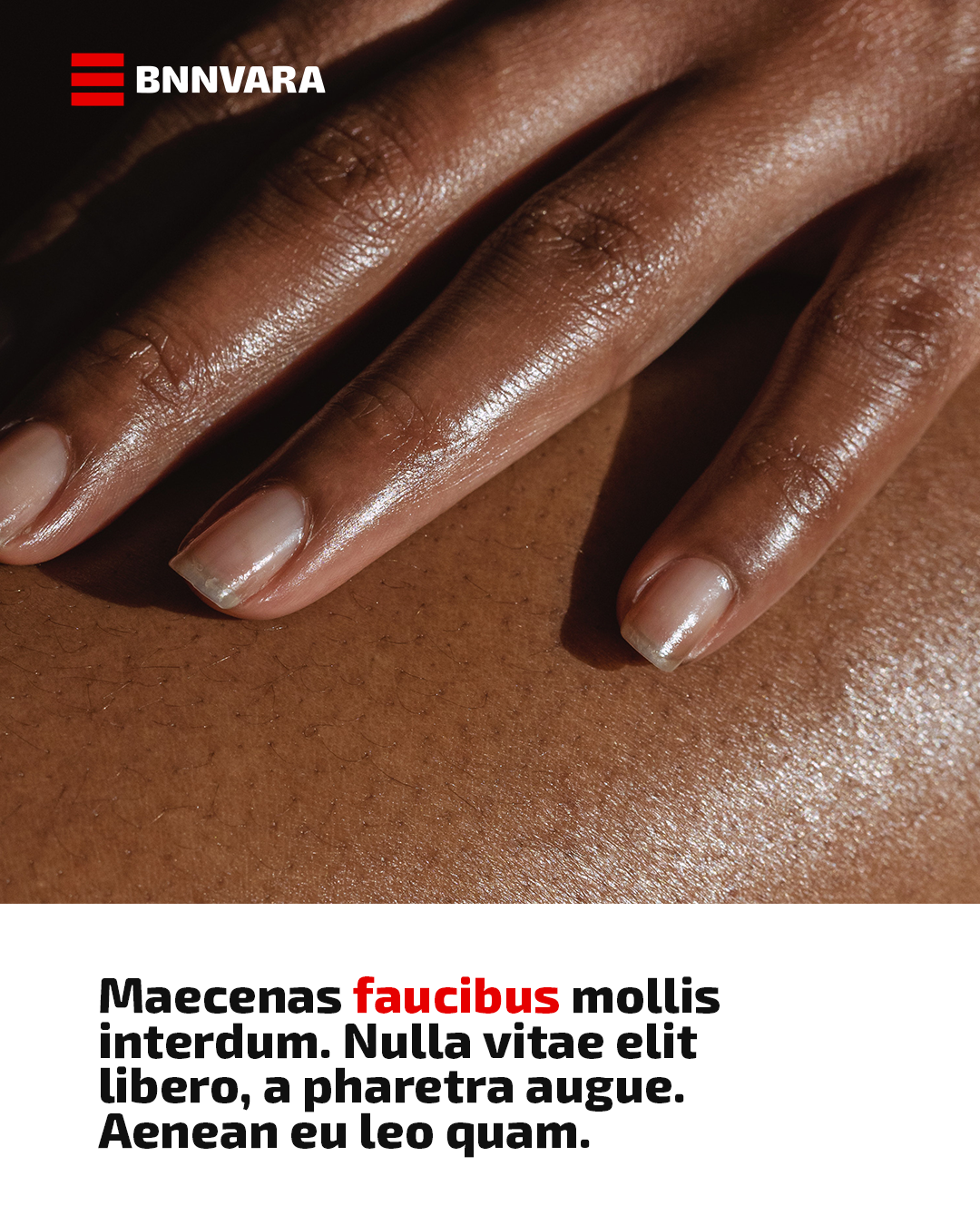
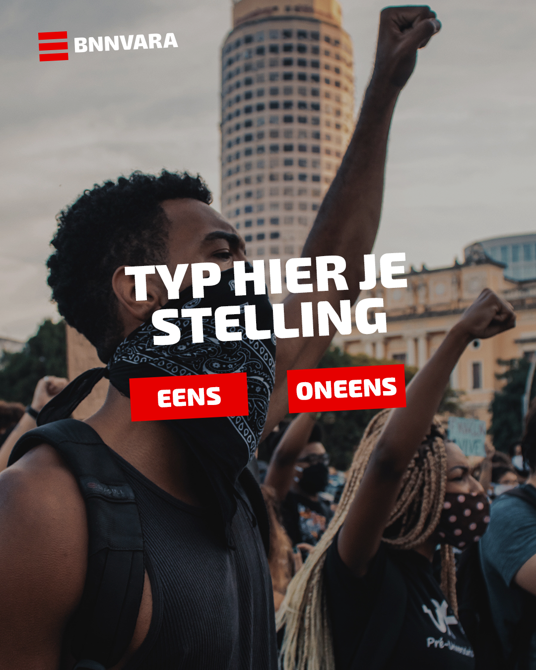
A handful of formats, one recognisable brand
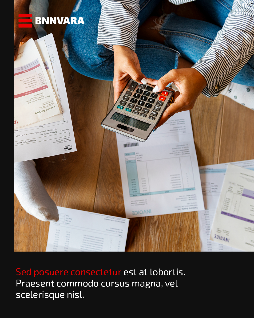
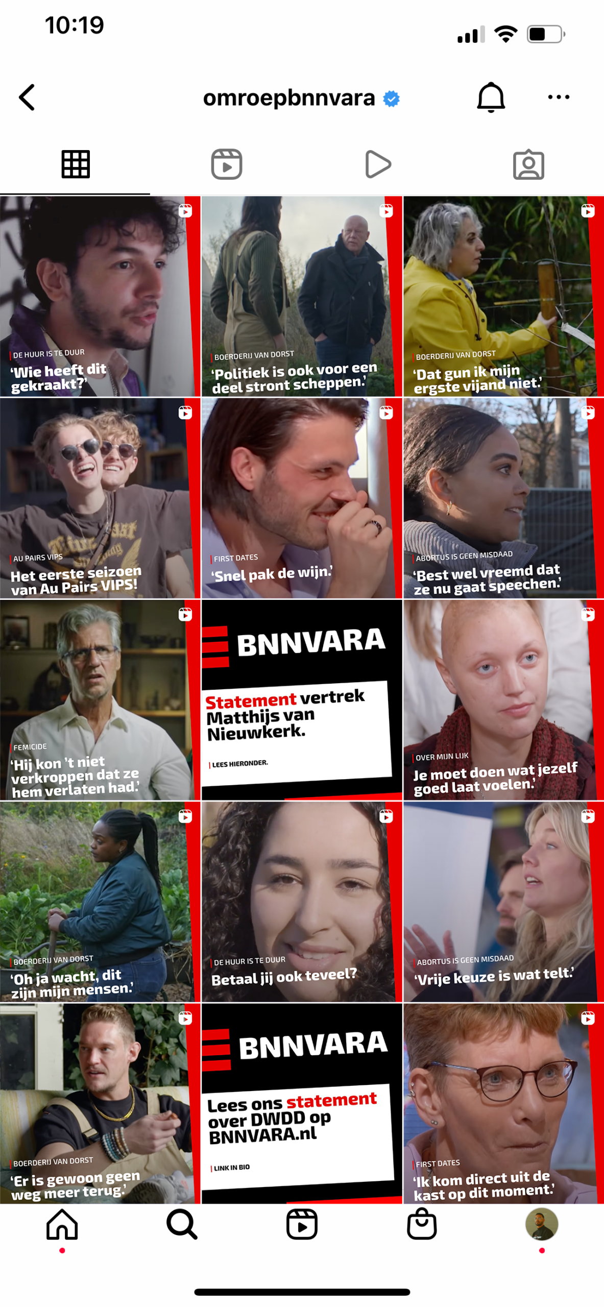
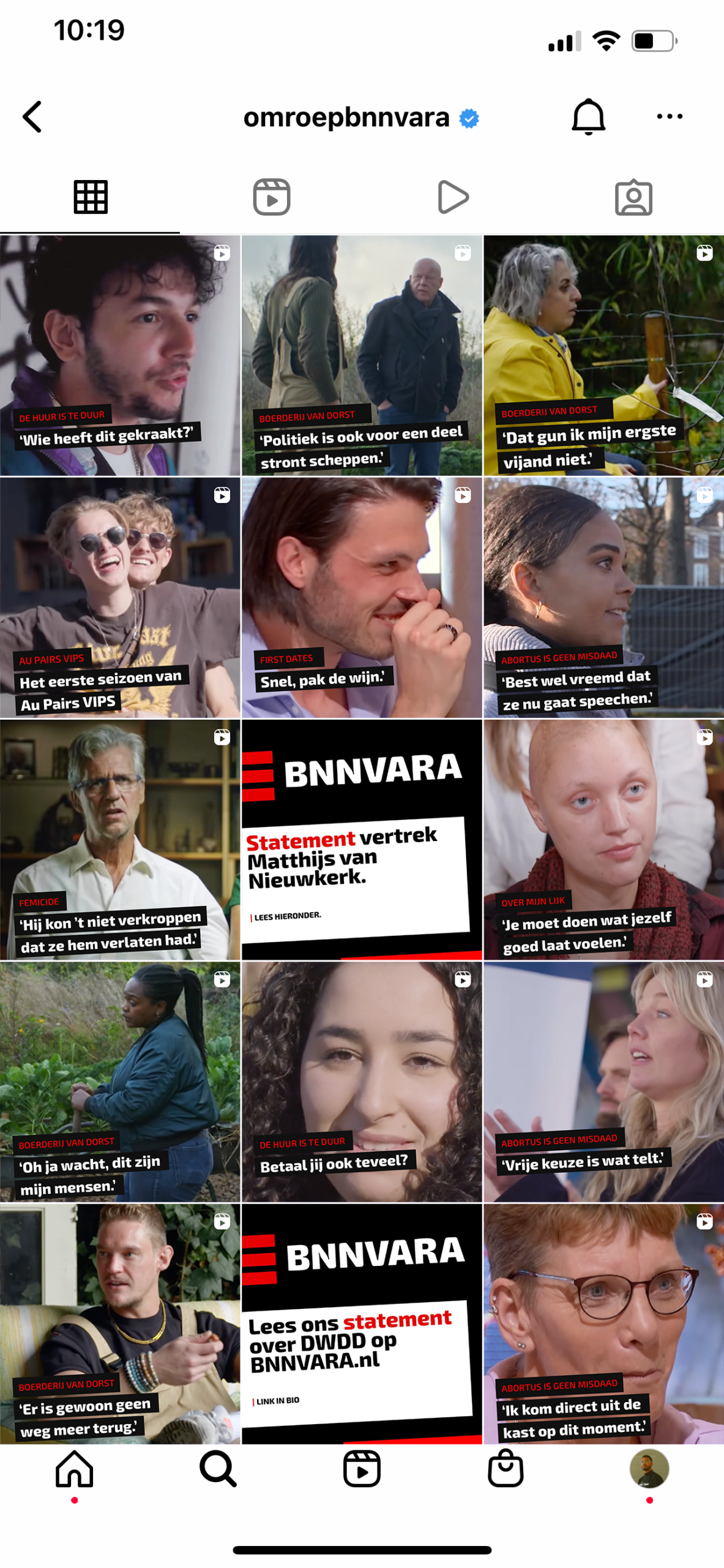
Readability is key when it comes to templates, which is why we chose to place the text on a solid block rather than over the imagery. This allows us to make the most of the brand’s vibrant colours while giving the imagery enough space to capture attention.
Various options to choose from
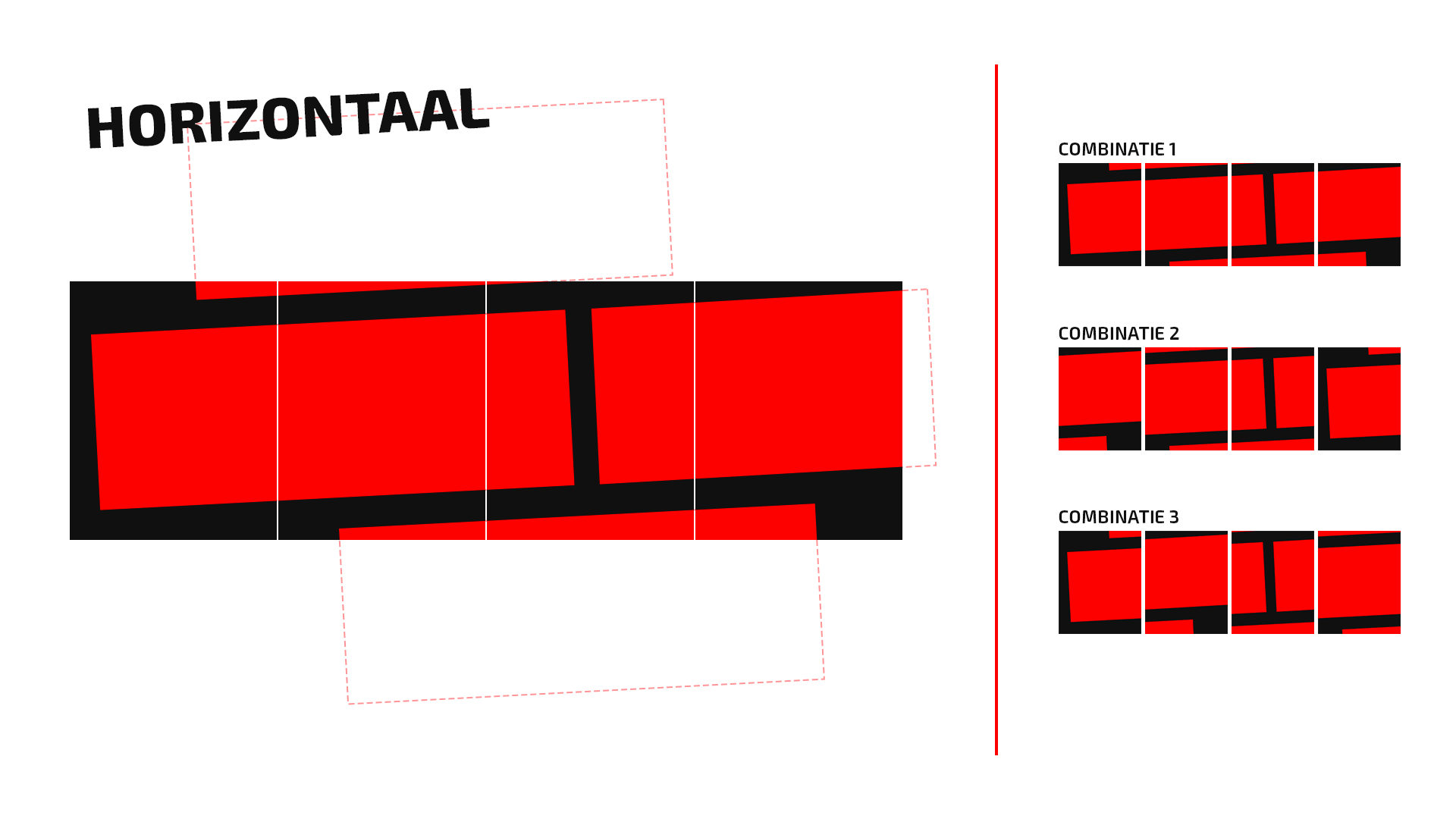
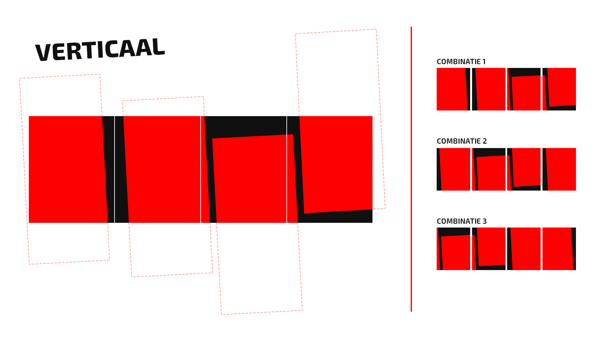
We explored a range of shapes and colour combinations to create distinct visual directions, giving the brand a variety of strong options to choose from.
Seen together, it reads as one brand.
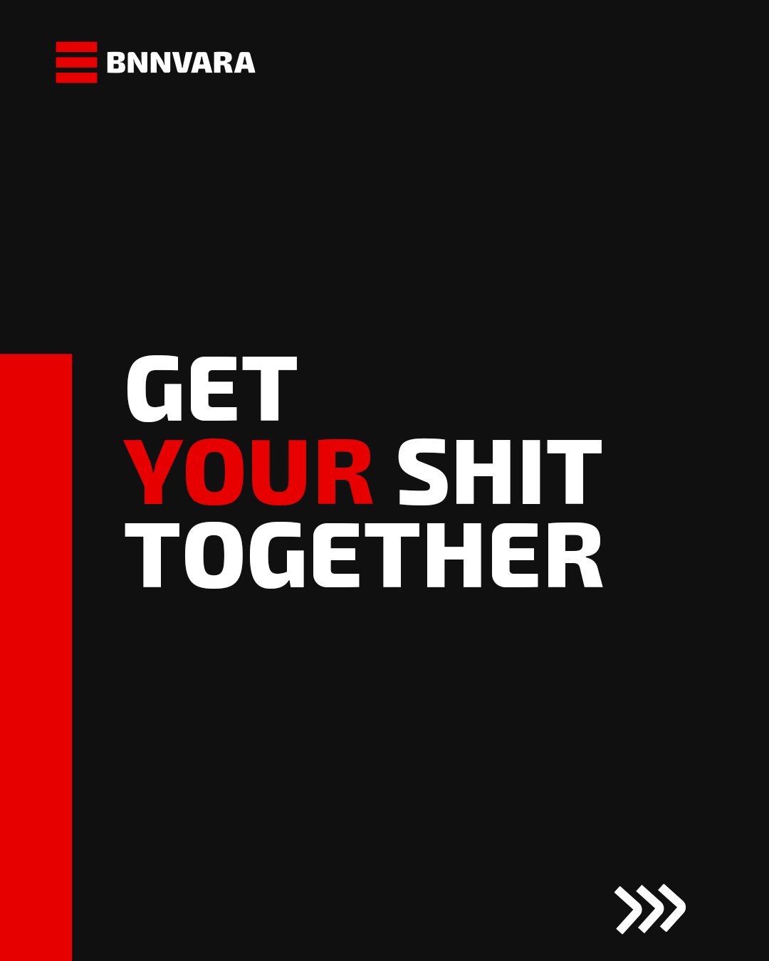
Next to the thumbnail options, we offered various templates and solutions for carrousel posts.